FPCJ
Discipline: Brand Identity · Campaign · Web Design
The Challenge
First Presbyterian Church in Jamaica is the oldest continuously serving Presbyterian church in the United States — organized in 1662, more than 350 years ago. When the lead pastor asked us to modernize their logo, we'd never branded a church before. His request was simple: appeal to a younger demographic. He felt the traditional Presbyterian mark belonged to an older generation and no longer spoke to the young families moving into the community, and he wanted it to feel genuinely welcoming.
Our Approach
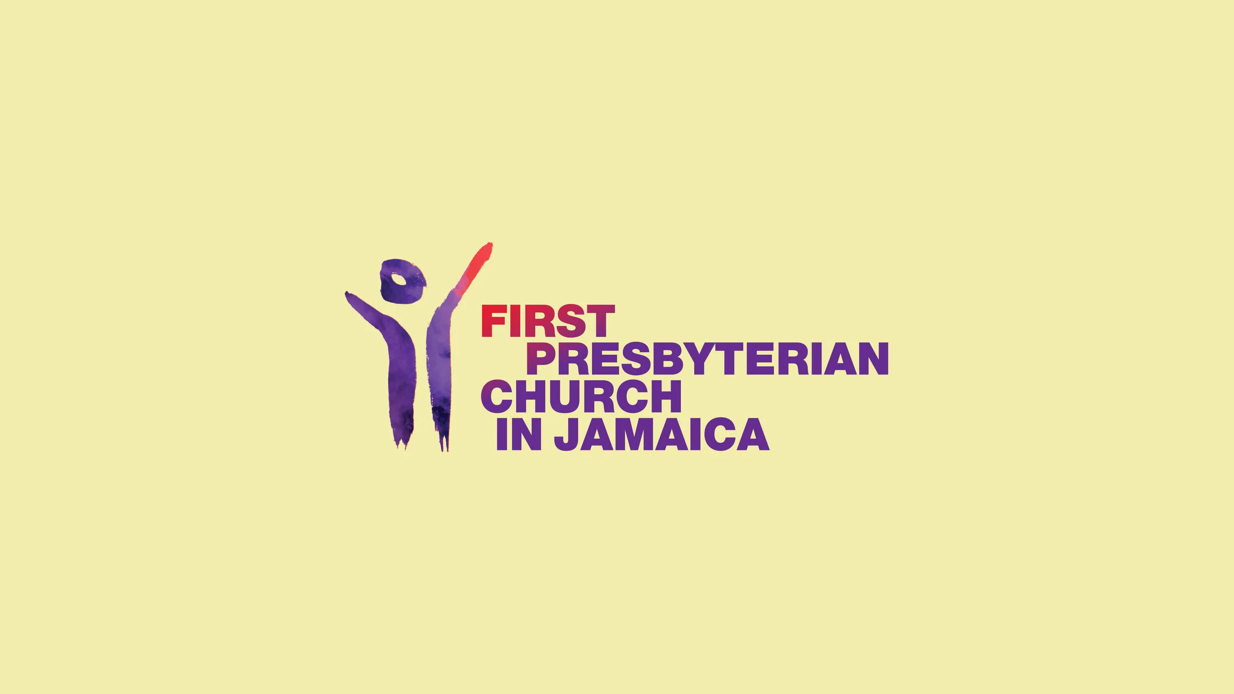
Understanding the community was everything here. Much of the congregation were families newly migrated from the Caribbean and parts of Africa, alongside long-standing African American families. We knew the mark had to be hand-done — something with real human warmth. So we drew hundreds of brush strokes, adjusting each one slightly and studying the abstract shapes they created. Out of that process came powerful symbols that felt joyful, welcoming, illuminating, and celebratory — a rich well to pull from, and a mark built to last for generations of families.
The Result
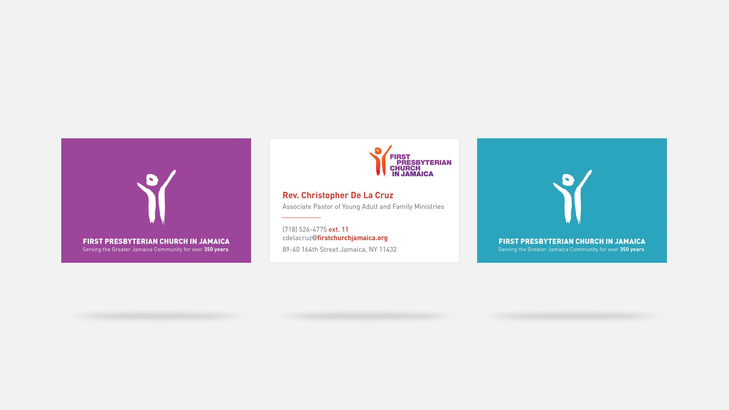
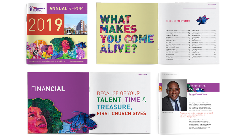
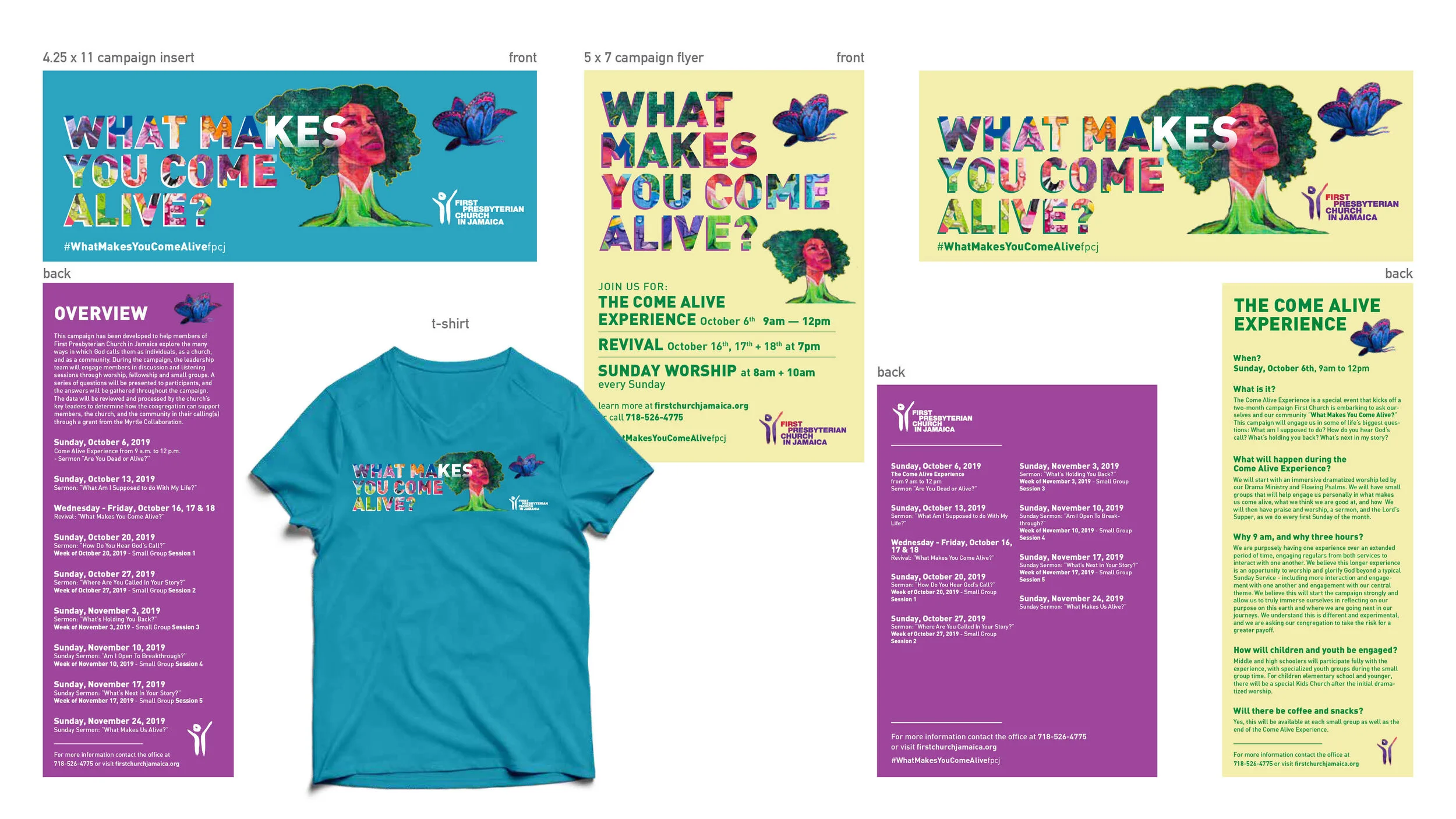
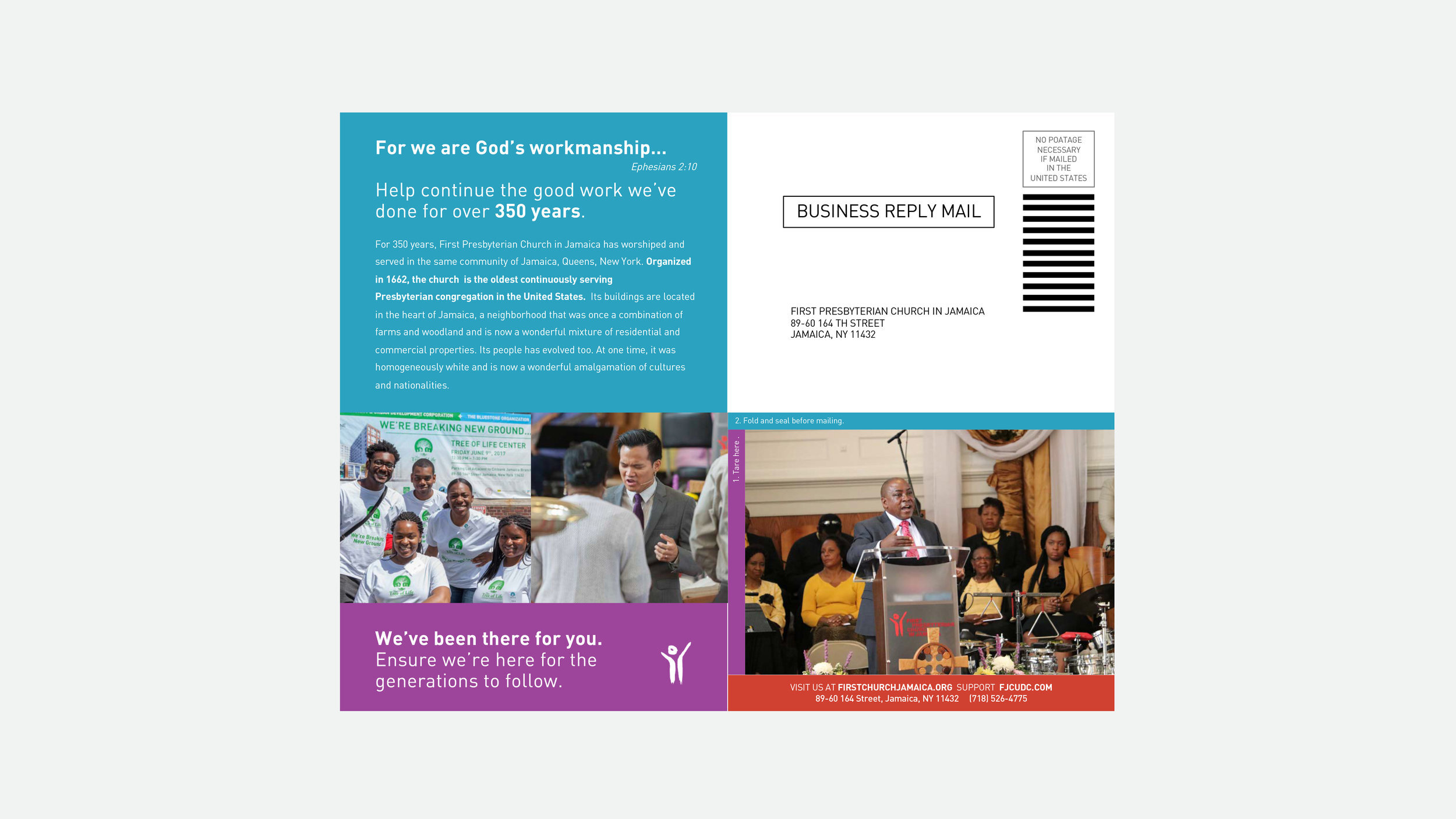
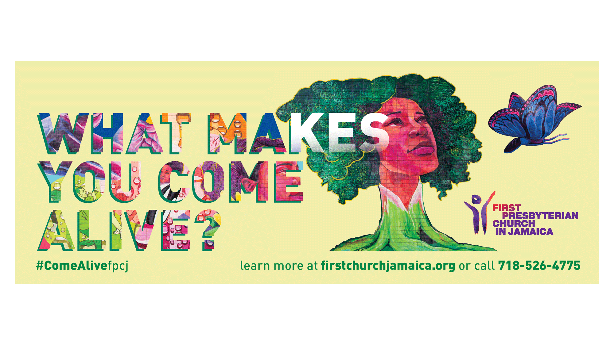
First Presbyterian Church in Jamaica stepped into its next chapter with an identity as warm and welcoming as its mission — a hand-crafted mark that honors 350 years of history while opening its doors to a new generation. From logo to brochure to website, the brand speaks to the diverse, growing community it serves, proving that even the oldest institutions can feel fresh, human, and alive.