Association of University Presses
Discipline: Brand Strategy · Brand Identity · Visual Identity System
The Challenge
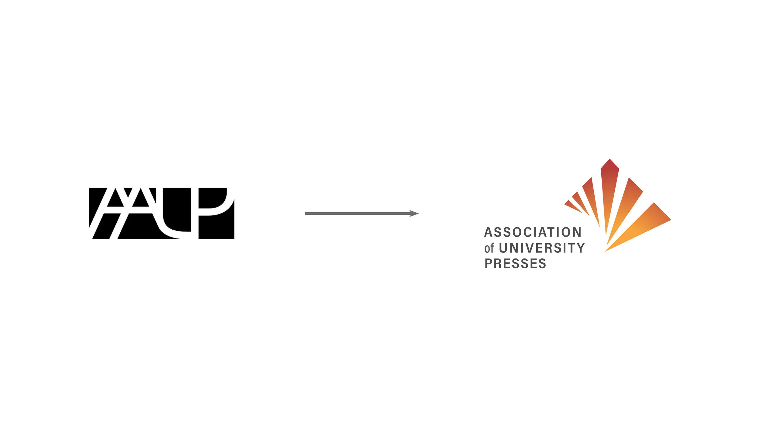
The organization faced tremendous confusion in the market. It was known by three different names — the Association of University Presses, the American Association of University Presses, and AAUP — and its acronym looked like countless other non-profits. On top of that, the logo had no visual system to support the organization's considerable brand equity. After more than a century, AUP wanted to resolve that confusion and step into a future-focused identity that matched a renewed mission and name.
Our Approach
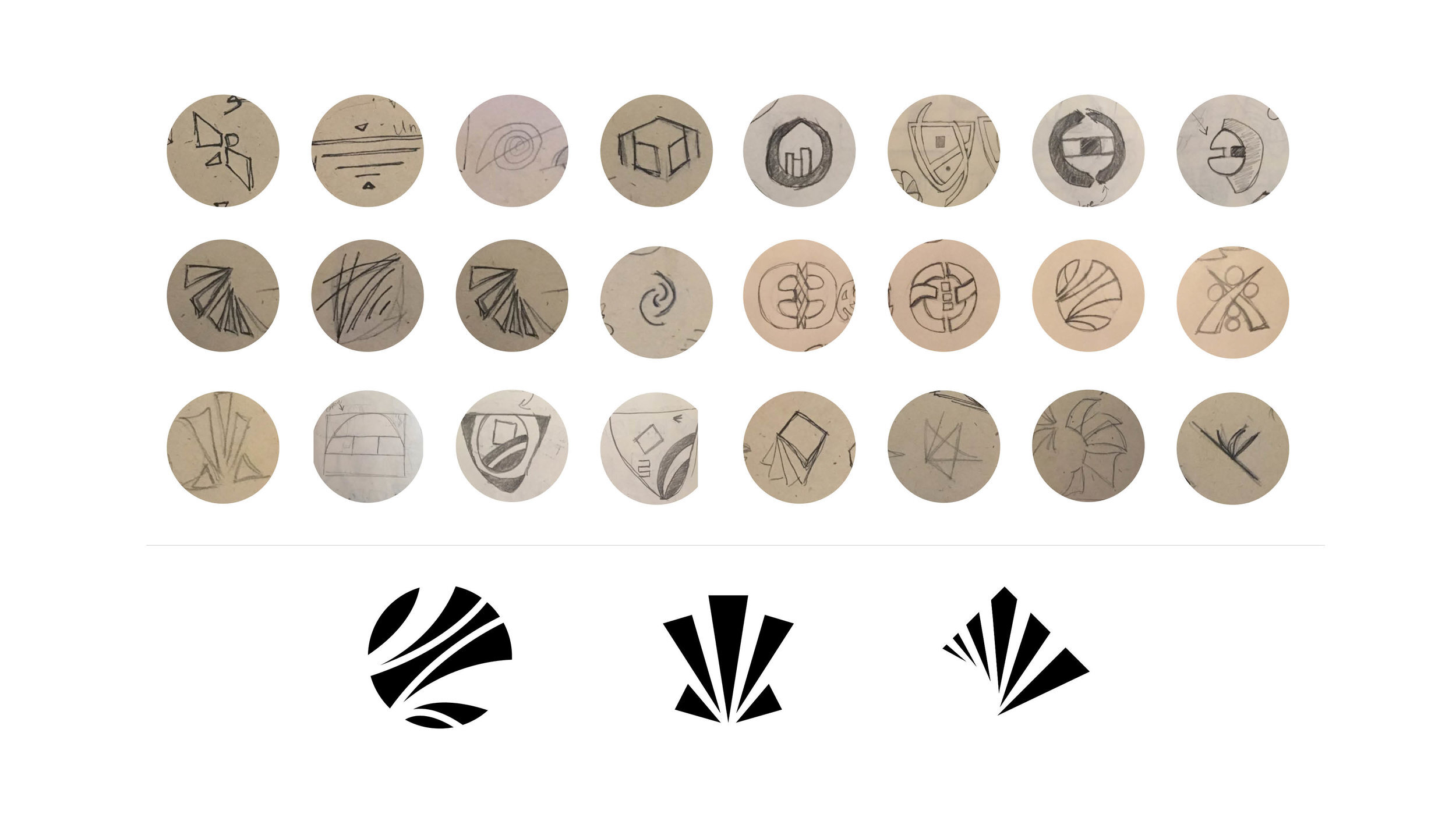
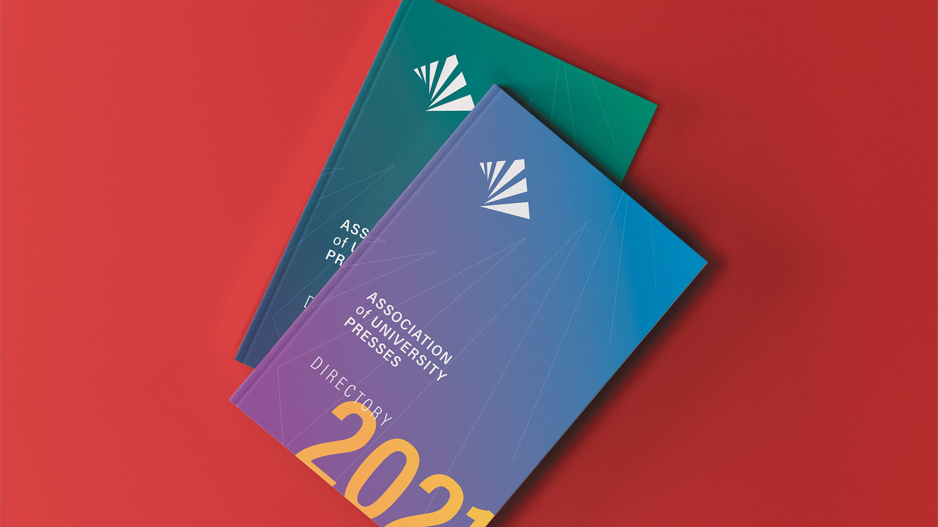
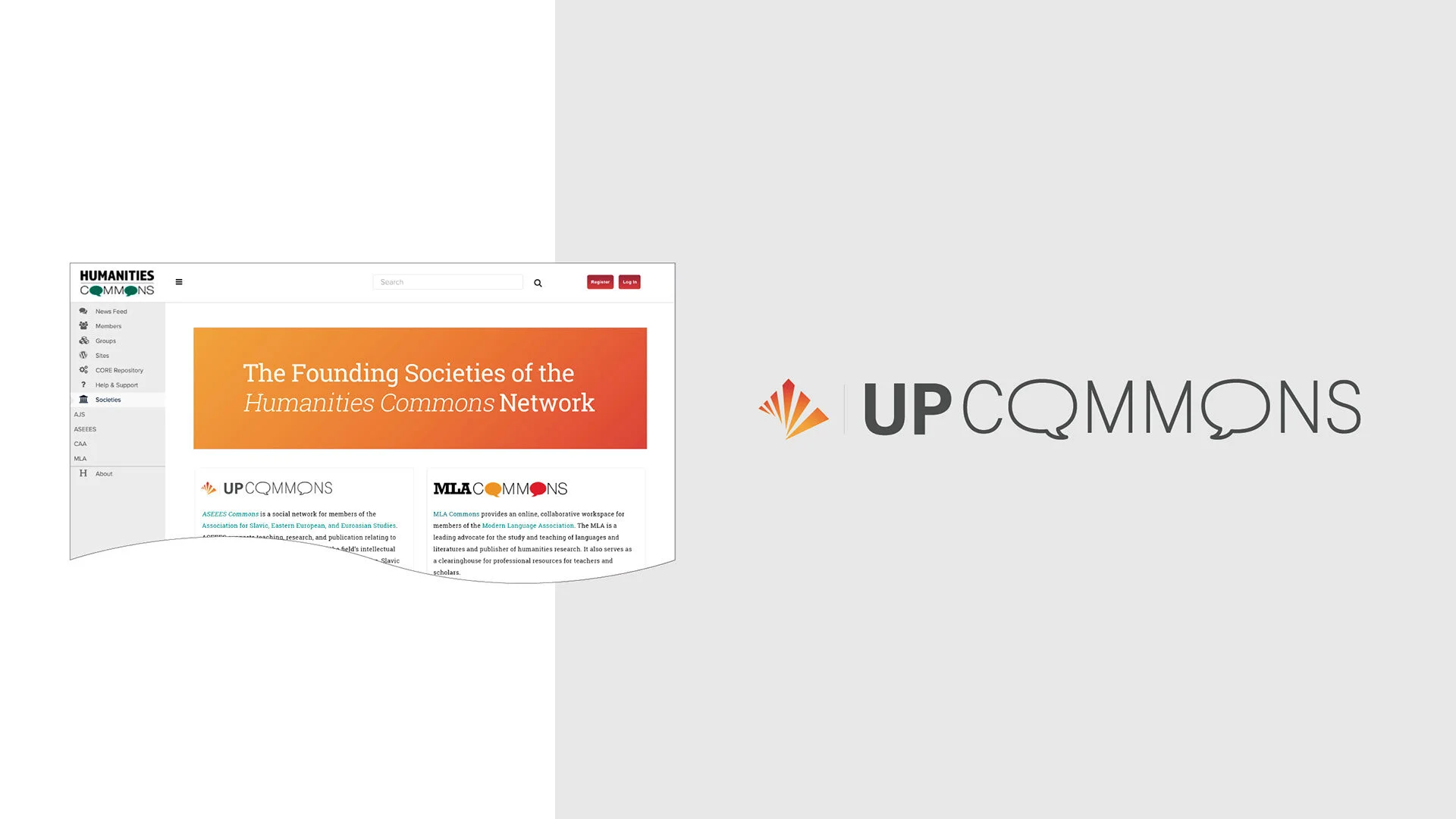
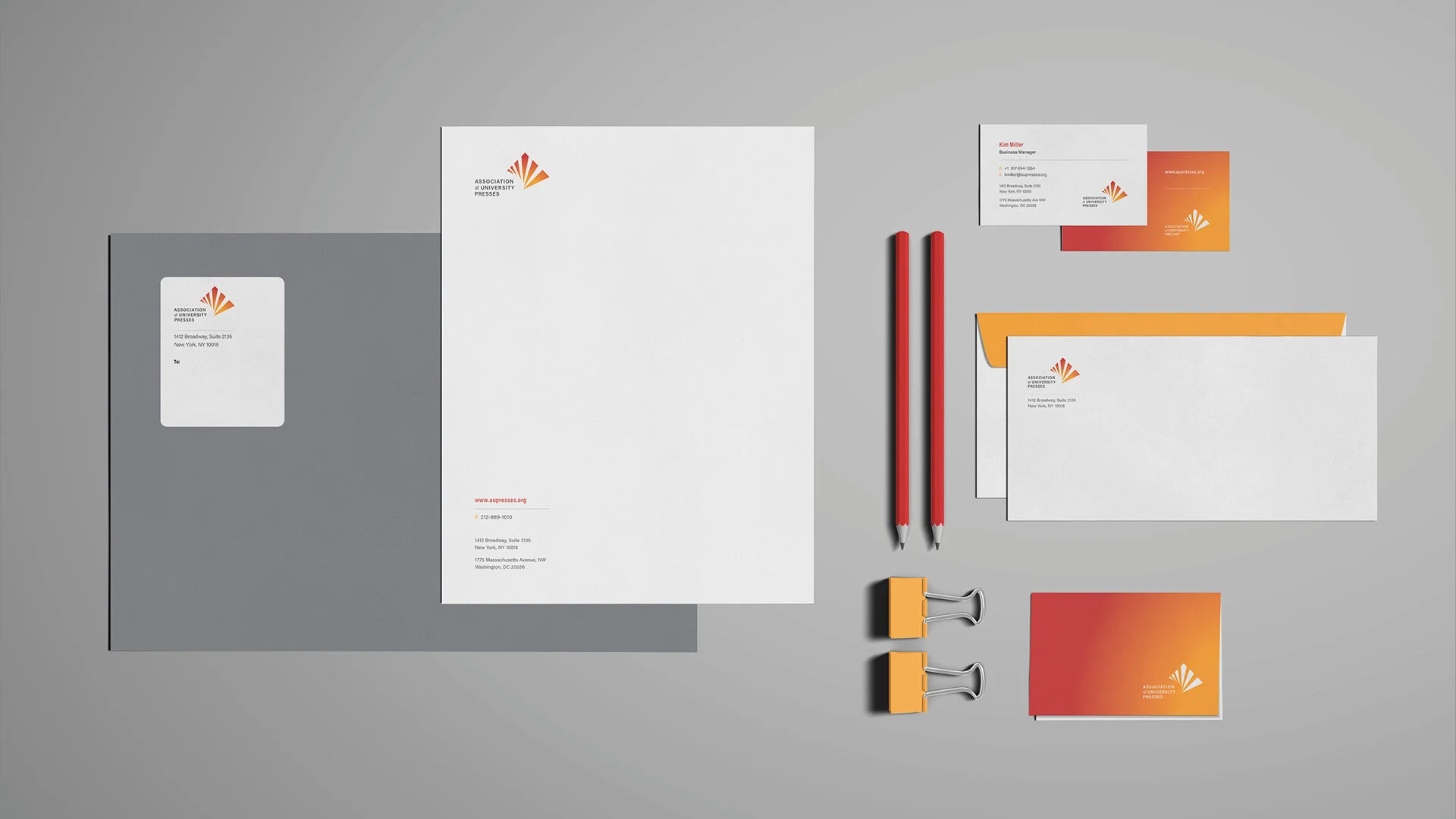
We grounded the work in strategy — drawing on in-depth insights and market research to understand exactly where the confusion lived and how to fix it. Partnering with Studiolo Secondari, we created an authentic, cohesive visual identity system built to launch the organization's new name and mission with clarity. Rather than a single logo, we developed a full system: one that unifies the brand under a single, recognizable name and gives a century-old institution a contemporary, ownable presence.
The Result
AUP emerged from more than 100 years of history with a clear, unified identity — one name, one system, and a future-focused look worthy of the organization's stature. The new brand cuts through the market confusion that once surrounded it, giving a storied non-profit a cohesive visual language to carry its mission forward for the next century.