Shinda Management
Discipline: Brand Identity · Creative Direction
The Challenge
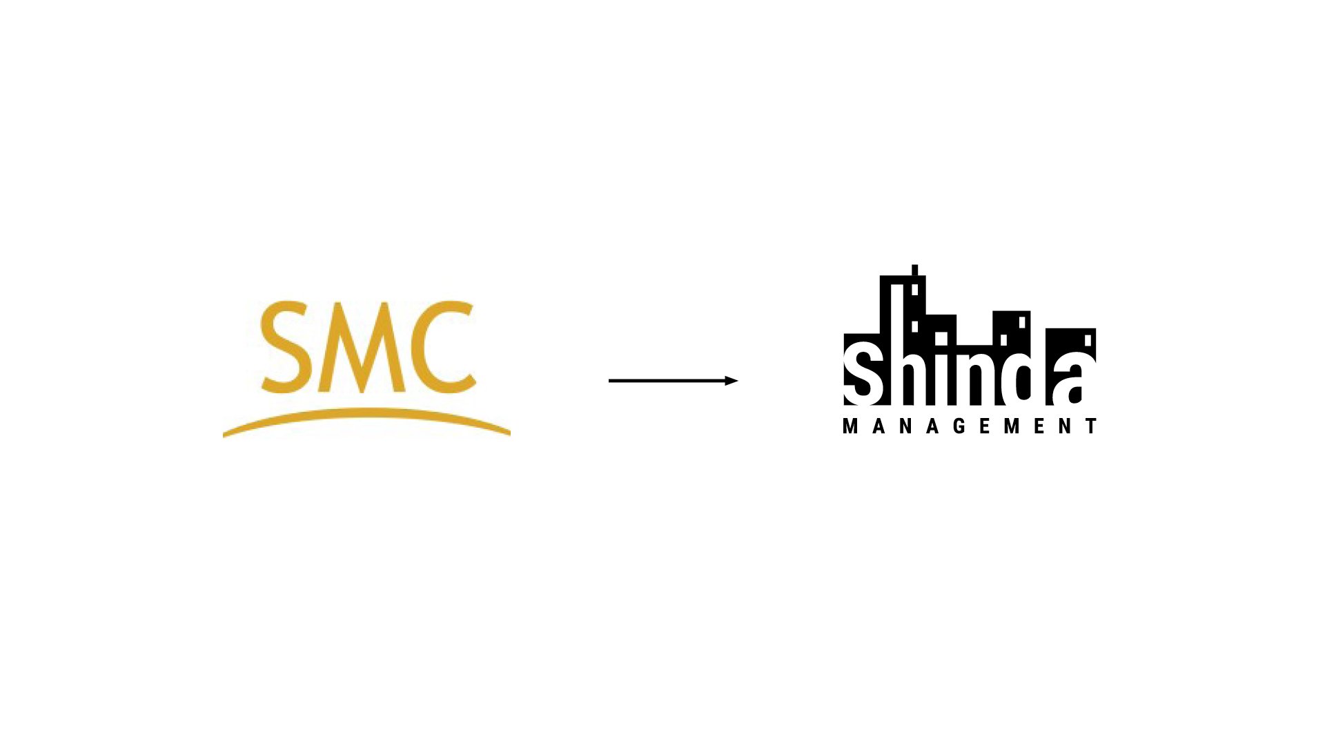
Shinda Management is a family-owned property management firm with more than four decades of experience bringing order to properties across the New York tri-state area. It's a business built on longevity and trust — the kind that quietly makes each property it touches thrive. But a legacy that deep deserves a brand to match. Shinda came to us to shape an identity that could honor its family roots while positioning the firm as modern, organized, and ready to grow — one that speaks to tenants and property managers alike.
Our Approach
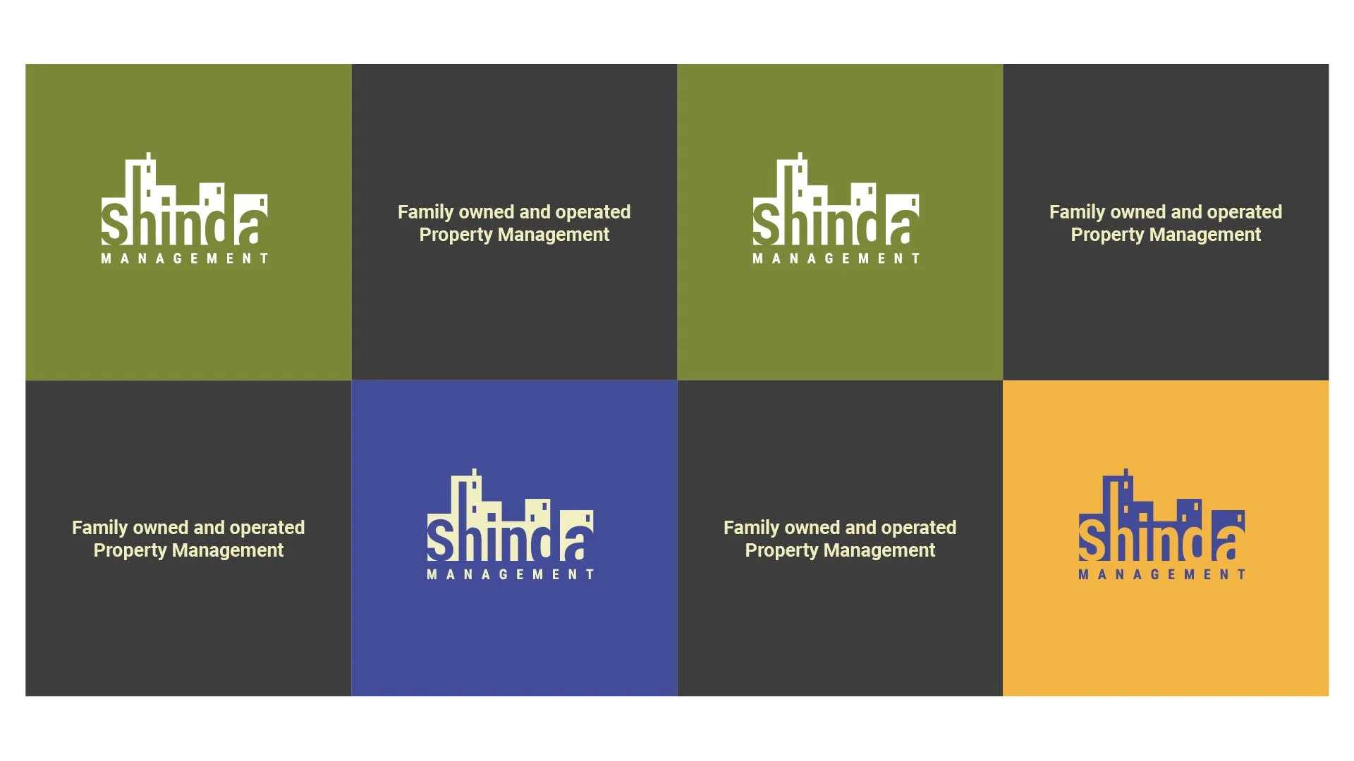
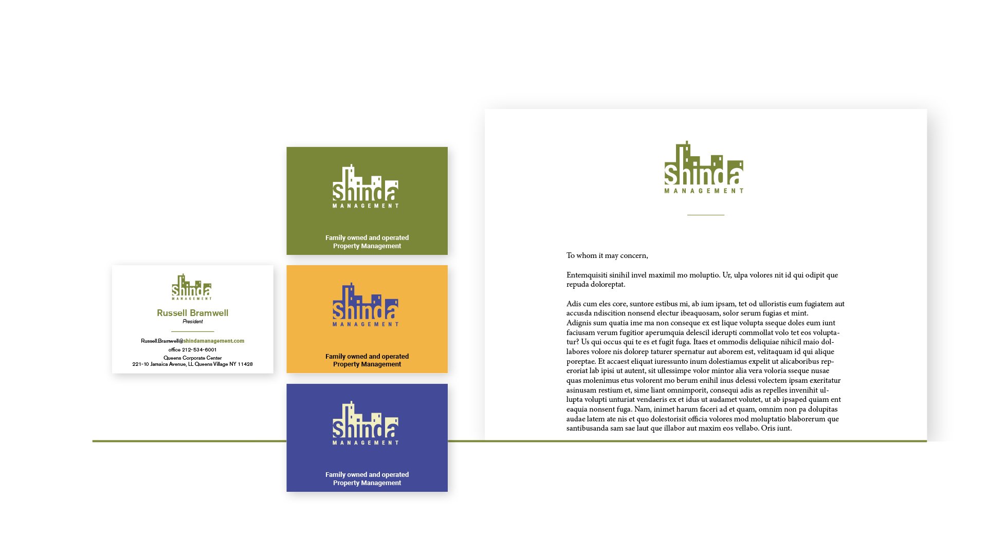
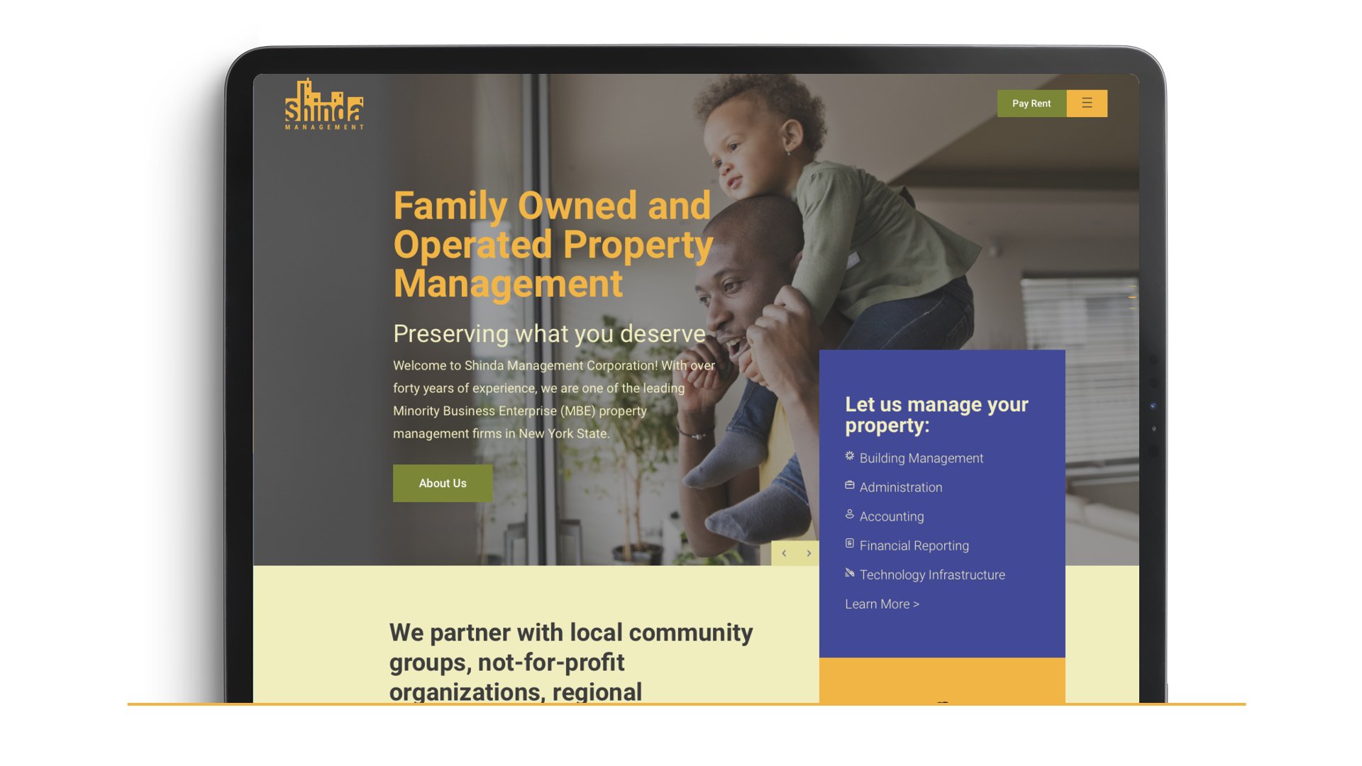
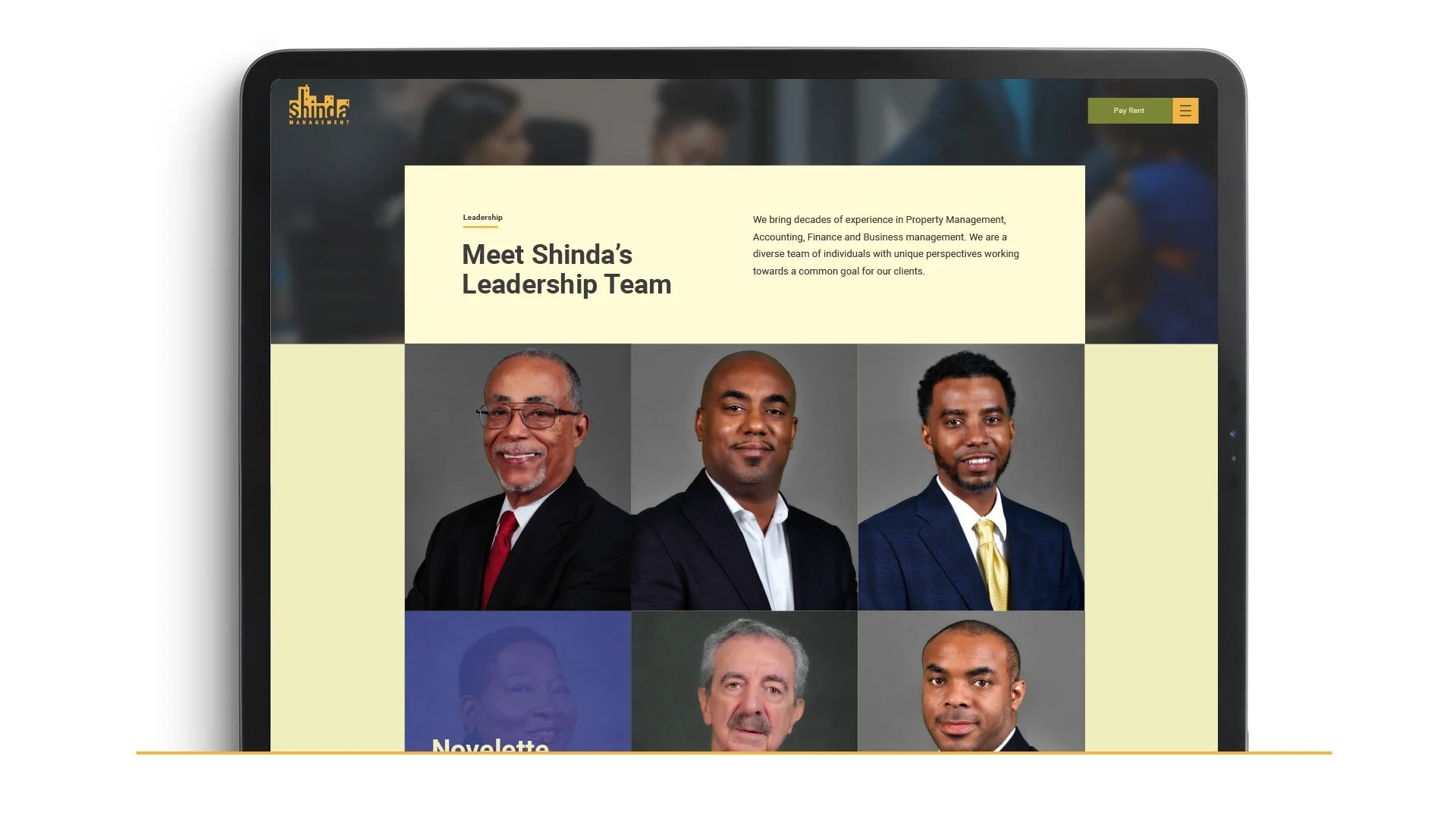
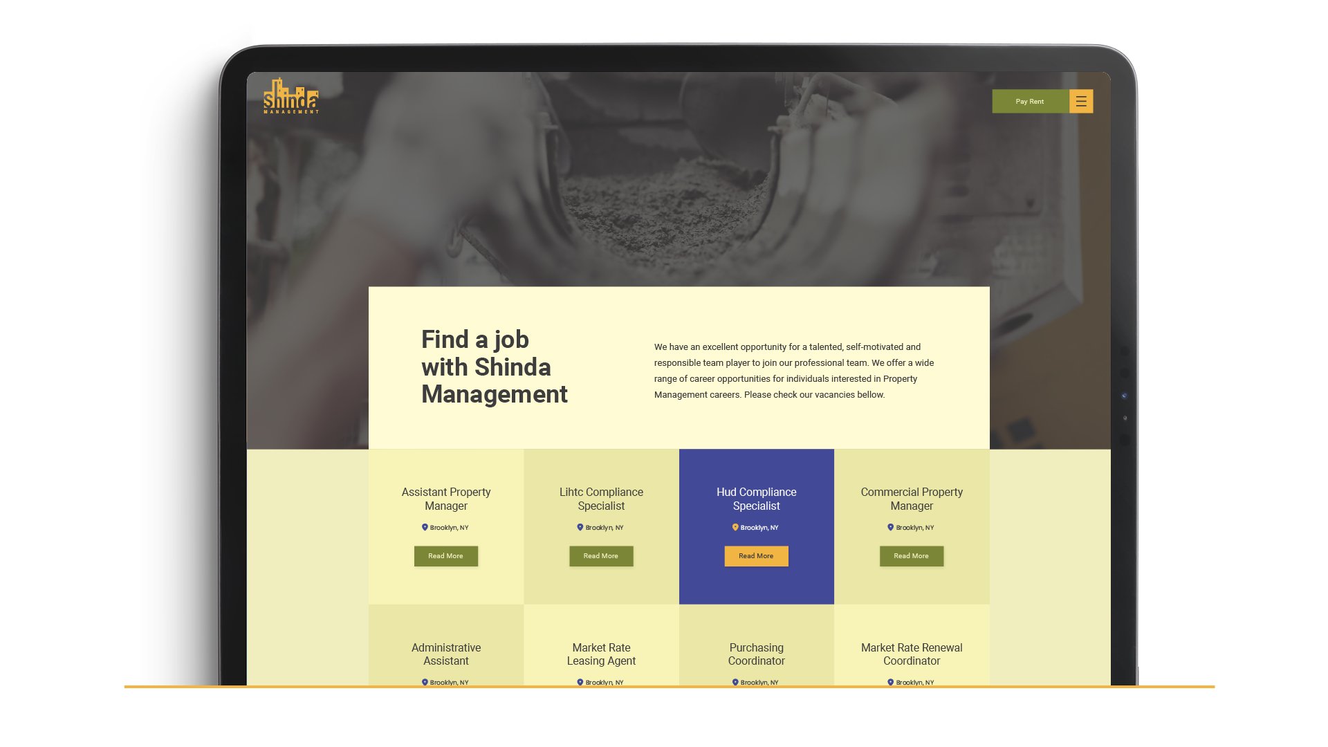
This was our client and our relationship, and we led the brand from the ground up. We developed a new visual identity — logo, colors, and voice — grounded in the values that define this family business: order, reliability, and care. To bring that brand to life online, we assembled the right team around the project, bringing in our partner Eflat to handle the web build while we directed the brand and creative throughout. The result was a mobile-first website that resonates with the new identity and works as a single, intuitive hub — where tenants can pay rent and find information easily, and prospective clients can identify rentals at a glance — supported by branded social templates that keep Shinda consistent everywhere it shows up.
The Result
Shinda Management stepped into its next chapter with a brand as established as its reputation — a cohesive identity that carries four decades of family legacy forward with a modern, organized edge. From logo to website to social, the system positions Shinda to network, reach new clients across the tri-state area, and keep growing, giving a longstanding family business the polished presence it earned.