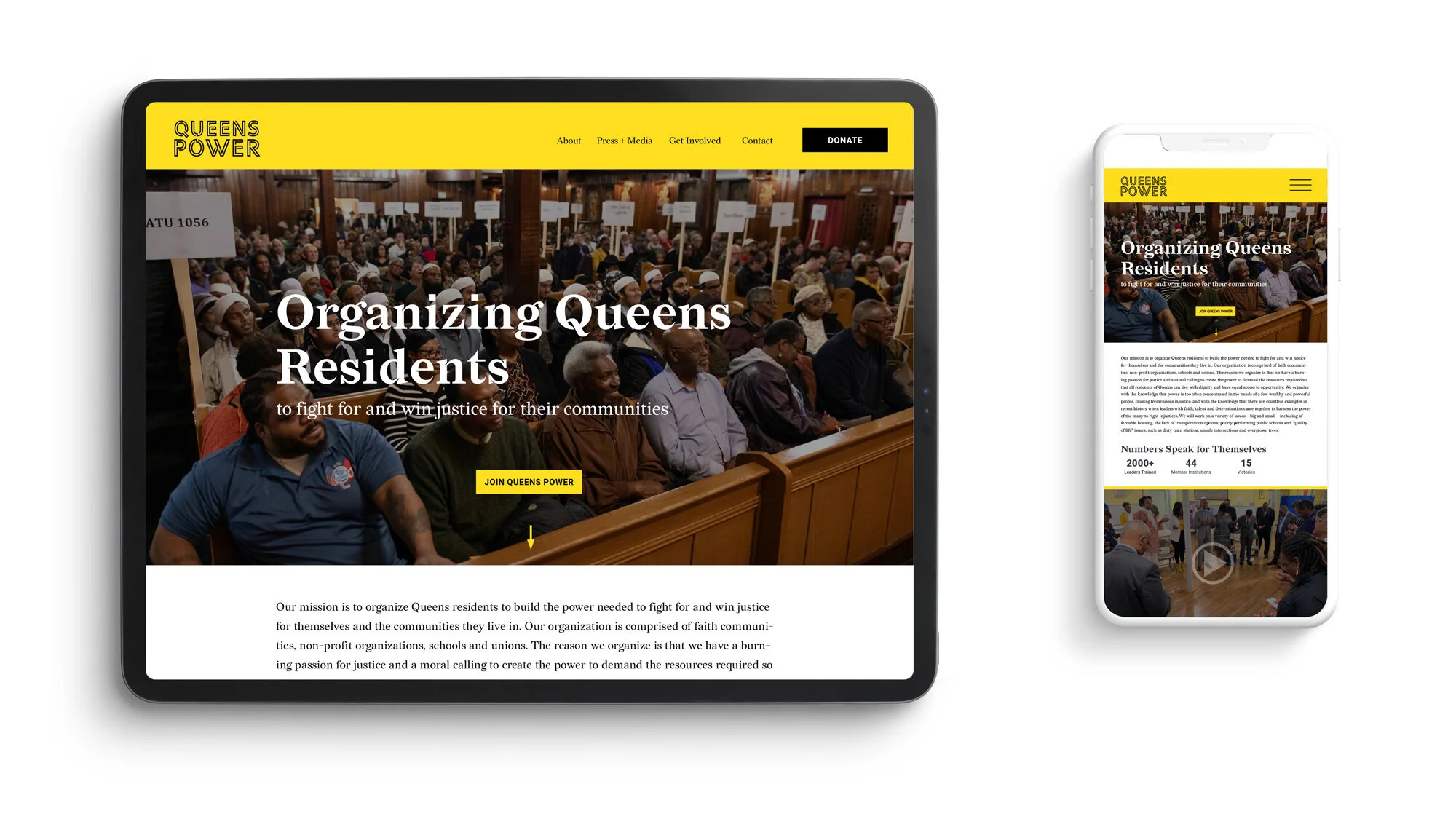
Queens Power
Discipline: Brand Identity · Art Direction · Web Design
The Challenge
Queens Power was created to organize the residents of New York City's most diverse borough to fight for — and win — justice for themselves and their communities. As a brand-new 42-member institution uniting faith communities, non-profits, schools, and unions, it needed an identity that could legitimize the organization from day one and, just as importantly, feel like it belonged to the very residents it aimed to mobilize.
Our Approach
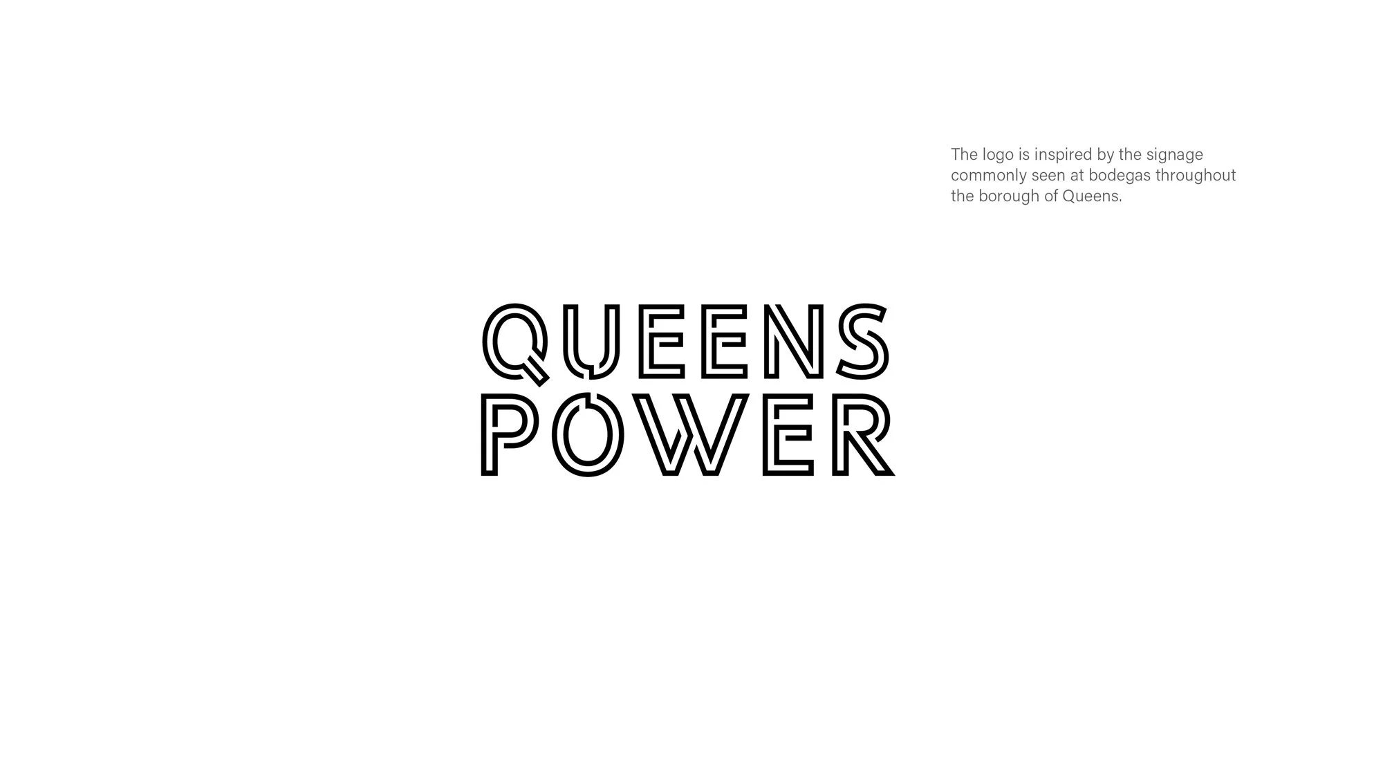
We built the visual direction around three brand attributes: strong, honest, and inclusive. To make the identity resonate with neighbors rather than talk down to them, we looked to the borough itself. The logo drew inspiration from the signage of the bodegas found on Queens corners everywhere — spaces that already felt safe, familiar, and part of daily life. That single cultural cue grounded the whole system in the community, turning a new coalition into something residents could instantly recognize as their own.
The Result
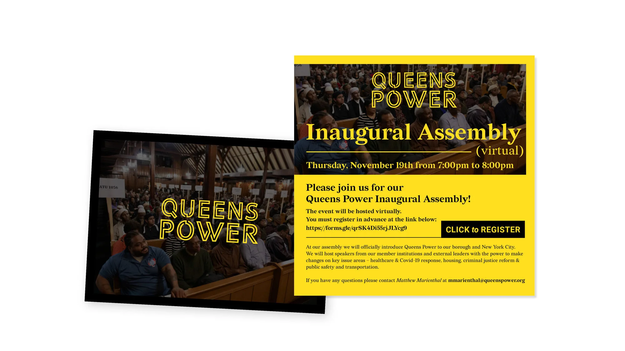
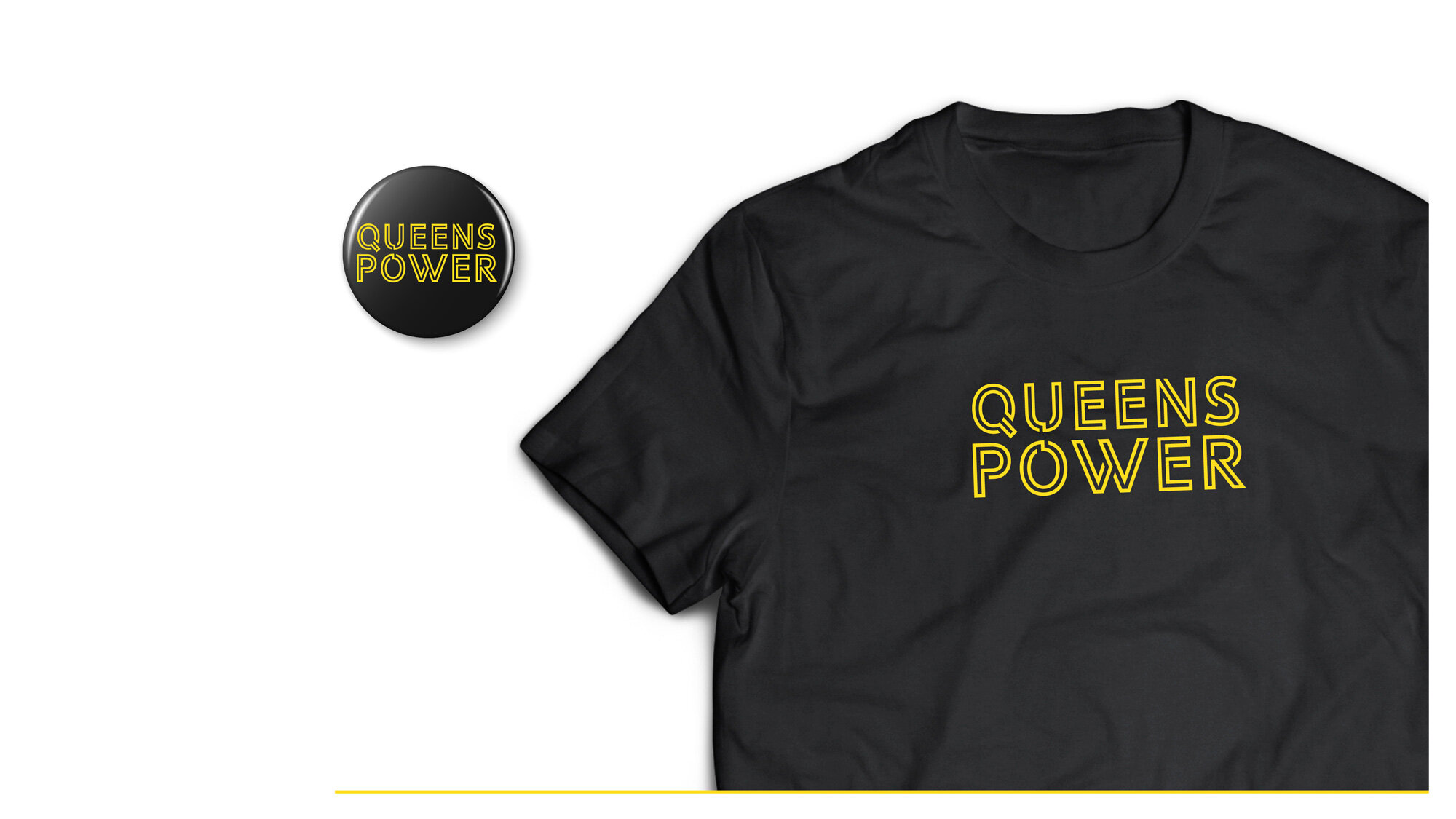
Queens Power launched with an identity and website that give a new coalition real legitimacy and a look that feels rooted in the neighborhoods it serves. By pulling from the everyday visual language of the borough, we gave 42 organizations one unified, unmistakably local voice — a brand built to organize, mobilize, and win.