Brisa Builders
Discipline: Brand Identity · Campaign · Web Design
The Challenge
Brisa Builders Corporation is a family-owned development, construction management, and general contracting firm in Brooklyn. It has an illustrious history, long-standing relationships, and a strong reputation built developing large, affordable, and faith-based projects across all five boroughs. But the existing brand and online presence didn't match that prestige. CEO Ericka Keller wanted to build on the legacy of her late father, Thomas Keller — once a developer for the Bedford Stuyvesant Restoration Corporation, the nation's first community development corporation — while carrying the equity of the family name forward.
Our Approach
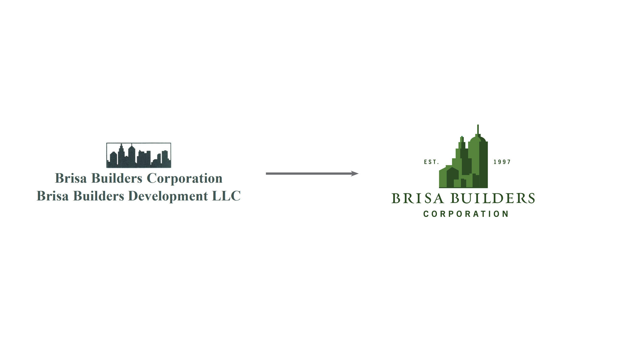
Because Ericka understood the value in her family name and the visuals her father had already established, we chose to honor that history rather than replace it — leveraging their storied past in the brand messaging. The original logo featured the New York skyline, but the treatment felt dated, so we kept the elements worth keeping and elevated the rest. We preserved the core colors while expanding the palette across the green spectrum, then simplified the skyline and used color to create shadow and volume. Finally, we selected an elegant serif typeface and customized its stems to sharpen the final mark.
The Result
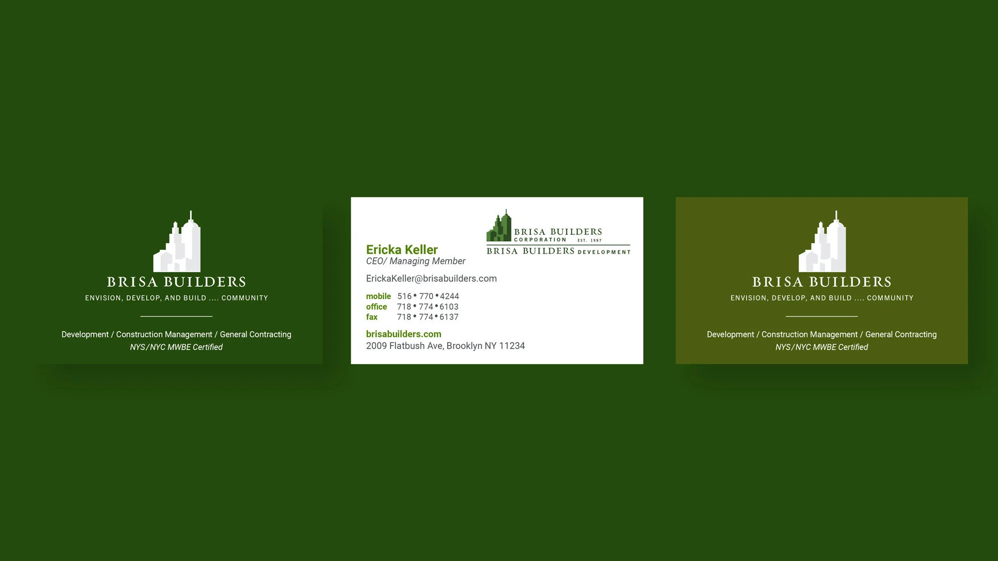
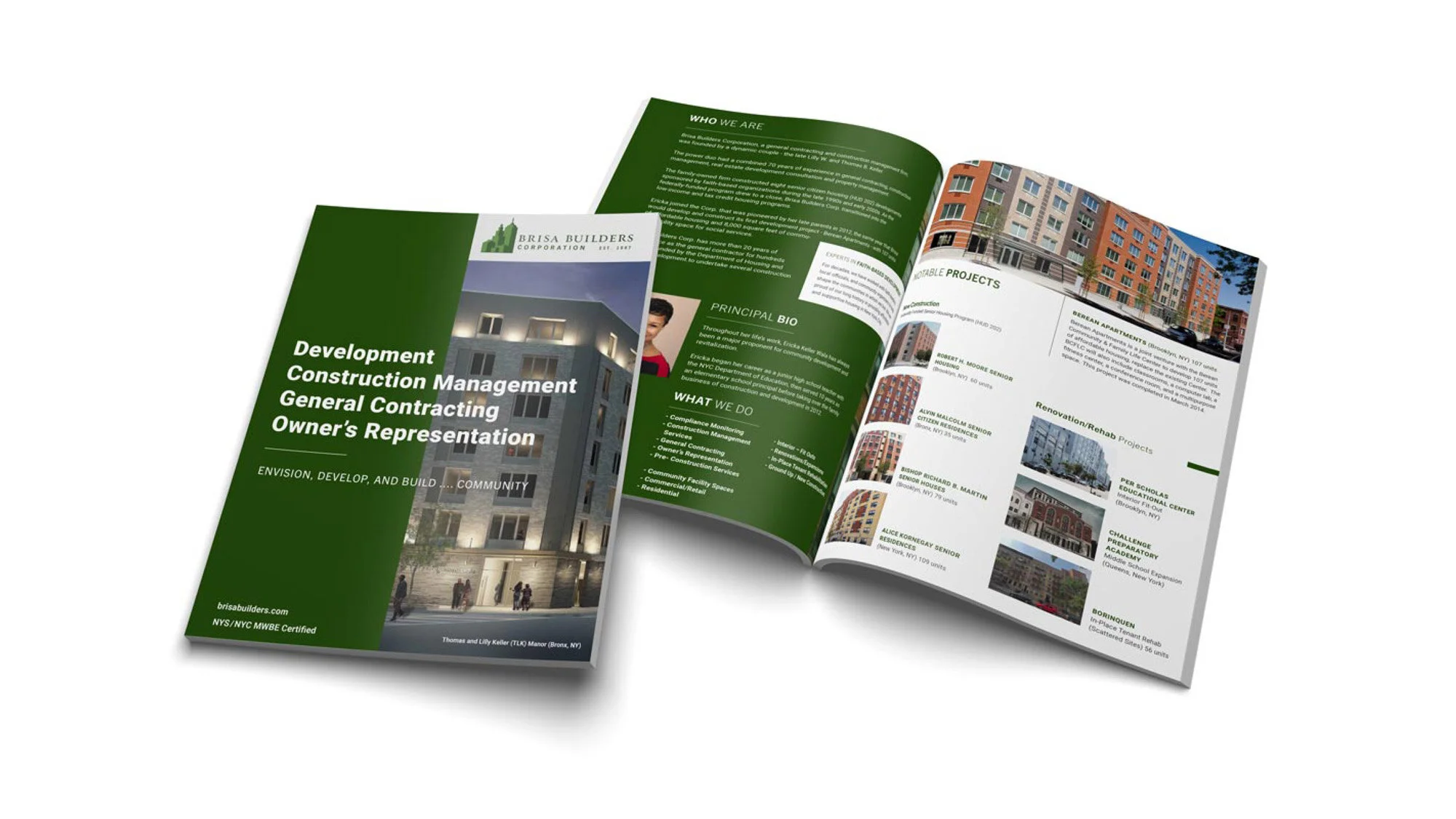
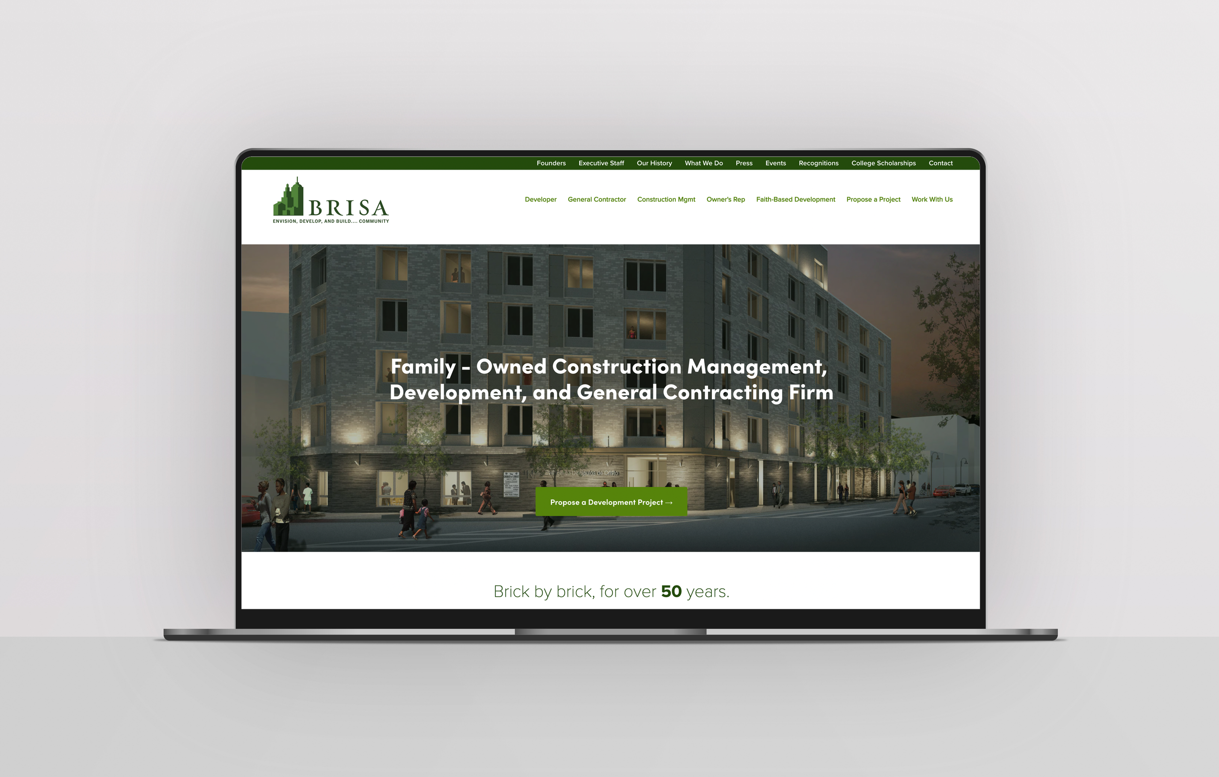
The outcome was a revised logo and brand voice that clearly communicate what Brisa Builders stands for as a developer and builder. Their new web presence celebrates their Brooklyn roots, their core capabilities, and their portfolio of work — a modern identity worthy of the family legacy behind it, honoring where Brisa came from while positioning it for where it's headed.